
Border Lines Between Top Navigation Links
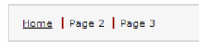
As you are adding sections to your portfolio, you may find that your top navigation module has several links. When the module fills up with links, you may notice that the text becomes a little overwhelming to the reader. One way to help fix this is to add a border line in between the links in your top navigation module. This will visually separate the links from one another, thus making the module easier to read.

How to Add Border Lines Between the Top Navigation Links
Find the following segment of code:
.navigation_topnav a {
color:#222222;
font-family: Verdana, Helvetica, Arial, sans-serif;
}
Within the method, add the following statement:
border-left: 1px solid #222222;
Note that you can modify the color of these borders by changing the hex code.
Now under that method add the following code:
.navigation_topnav a:last child {
border-left: none;
}
Video Tutorial
For a video tutorial on how to add border lines between top navigation links, check out the CUPID Associates video below:
For a video tutorial on how to add border lines between top navigation links, check out the CUPID Associates video below:
