
Making Button Links
One thing you can do with CSS code in Digication is to make your top and left navigation links look like buttons. There are several possible reasons you might choose to do this. One reason is that it looks unique and could add to the visual appeal of your page if you incorporate your personal branding into the button style. If you do choose to use buttons for your top and/or left navigation links, remember to adjust the appearance of your buttons to appropriately fit your portfolio design.
How to Make Your Top Navigation Links Look Like Buttons
Before you begin formatting the appearance of your links, you may want to remove the top navigation border and background color. To remove the border, change to border in #module_topnav to 0px, and to remove the background change the background-color in .navigation_topnav to match your main container background (default is #ffffff).
Before you begin formatting the appearance of your links, you may want to remove the top navigation border and background color. To remove the border, change to border in #module_topnav to 0px, and to remove the background change the background-color in .navigation_topnav to match your main container background (default is #ffffff).
|
For square buttons, find the section of code that looks like this:
.navigation_topnav a { color:#222222; font-family: Verdana, Helvetica, Arial, sans-serif; } Under that method add the following code: .navigation_topnav li { float:left; } .navigation_topnav a:link, .navigation_topnav a:visited { display:block; width:auto; font-size:14px; font-weight:bold; background-color:#ABABAB; color:#ffffff; padding:10px; text-transform:uppercase; border-radius:0px; } .navigation_topnav a:hover, .navigation_topnav a.selected { background-color:#BAC5C9; } |
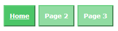
Top Navigation Square Buttons
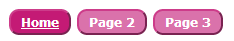
Top Navigation Rounded Buttons
|
You may adjust the font and color values in the second and third methods to change the style of your buttons. You can also make your buttons appear more dimensional by adding an inset or outset border (see Border Lines). If you want to make rounded buttons, change the border-radius to 10px;
|
How to Make Your Left Navigation Links Look Like Buttons To make square buttons, add the following code: .navigation_leftnav li { float:left; } .navigation_leftnav a:link, .navigation_leftnav a:visited { display:block; width:auto; font-size:14px; font-weight:bold; background-color:#ABABAB; color:#ffffff; padding:10px; text-transform:uppercase; border-radius:0px; margin-right:20px; } .navigation_leftnav a:hover, .navigation_leftnav a.selected { background-color:#BAC5C9; } |
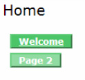
Left Navigation Square Buttons
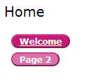
Left Navigation Rounded Buttons
|
You may adjust the font and color values in the second and third methods to change the style of your buttons. You can also make your buttons appear more dimensional by adding an inset or outset border (see Border Lines) If you want to make rounded buttons, change the border-radius to 10px;
Note that in the "Edit" tab with the left navigation as buttons, sometimes the section title will be highlighted. If you switch into the "Published" tab, this will not happen.
Note that in the "Edit" tab with the left navigation as buttons, sometimes the section title will be highlighted. If you switch into the "Published" tab, this will not happen.
Video Tutorials
For a video tutorial on how to turn your top navigation module into button links, check out the CUPID Associates video below:
For a video tutorial on how to turn your left navigation module into button links, check out the CUPID Associates video below:
